Rating Soccer Boy Game Day Outfits: BACK AND BETTER THAN EVER
It’s the start of a new school year, and things have changed a lot since late November of last year: a new freshman class, the schedule (gross), and on a note more related to the topic of this article, section realignments for WPIAL soccer. In that span, what has occurred concurrently is the gifting of merchandise to the Boy’s Soccer Team for winning their premiere state title, as well as many online stores opened for the purpose of raising funds for our sports teams. With that has come a collection of centerpieces in people’s wardrobes trickling into people’s wardrobes (hoodies, v-necks, windbreakers) and as such, an opportunity to build new outfits. In my opinion, the most logical results using the latest innovations in algorithm design and statistical analysis would suggest a trend towards techwear x avante-garde, but alas, this has not been the case.
Mert:
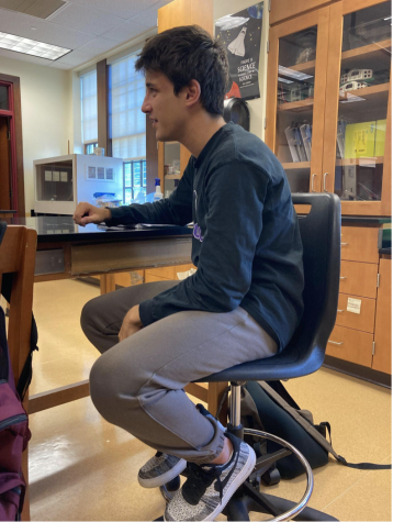
Many geniuses have been unrecognized in their time. Take the historical example of Galileo Galilei, a man who challenged the preposterous notion of helio-centrism, and was consequently sentenced to house-arrest because the Roman Catholic Church didn’t like that he was challenging the “science” that validated their dogma of “solely being deserving.” Take the modern example of night owls: they are often chalked up to being “murderers, reddit-MODs, and the generally slothful.” But, night owls see the beauty that no one else sees and allow us to continue seeing it; they man the power plants so that you aren’t the victim of the next Chernobyl or 3-mile-island, all while under Big-Dipper, Ursa Minor, and all the other constellations in the night sky. They see them so clearly, unlike an average heathen who blends them together like a light microscope trying to see organelles, bags under their eyes and ever-growing.
This statement describes the fit. There is no visible dress shirt or tie; it is a rage against tradition because you cannot see it. And that is the beautiful statement, and the fit for the runways of Mr. Gosha Rubchinskiy.
Final Rating:
8.5/10
Harry:
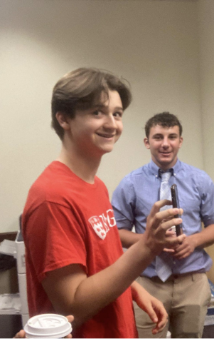
This picture, with all its elements, is like a large-sized onion at the grocery store later caramelized on the stove, or Andy Warhol’s cover for the velvet underground, which is a screen-painted banana. You peel, until it is bare. The bare banana and core of the onion is Harry and his outfit. His outfit is almost all blue, and the tie almost blends in with the shirt, making the unit inconspicuous, almost boring. But what he earns bonus points for is paying attention to his surroundings. Just like the pink cup or the red shirt, and although the pants look like they are exactly the wall, the blue juxtaposes it, and one can appreciate the breakup of the mustard and mille-feuille cream-colored walls from time to time.
7/10
Torey:
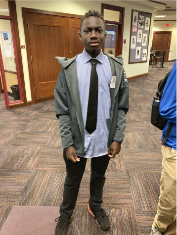
Torey’s showing off one of the new pieces that he got, and I personally think it makes a great centerpiece to style around. The jacket has various embroideries, giving it a handmade and personalized touch. It itself has a clear techwear and athleisure aesthetic, but it has managed to have been spiced up with the baggier proportions with the shirt and pants. Black ties are a classic, and it’s been artfully used here, simultaneously as a slight gradient to the pants and contrast with the shirt.
Final Rating: 6.9/9.1
Tommy:
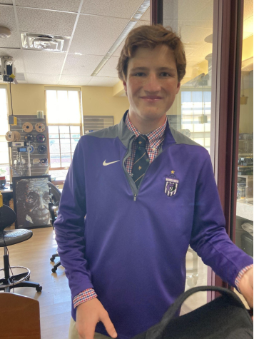
This is showing off another centerpiece that the boys team acquired as reward for winning States. To be noted is the gray trim on the shoulders, which complements the school colors nicely, the white Nike swoosh, and the most notable of them all, the embroidered bears logo, based off of the various logos for various national teams which can be seen on the kits of the world-cup qualifiers on the Adidas website and in Qatar later this year. Legally, to promote support for the student government and the supreme leader, I should give this a 10, but I would give it a 10 regardless. The shirt serves as a bombastically understated example of effective contrast with not only visuals, but with messaging. It breaks up the blocks of purple and gray with a pattern with a checkerboard of popping reds, blues, and whites, all with a decadence tie to “tie” it together. The quarter-zip and tie represent the better things in life, polished, blocked out, and easy everyday life as royals and high-ranking government officials like to live. The shirt, on the other hand, is a shirt that a working man like a farmer, or rather a proletariat, would wear. It gives off ambiguous messaging that appeals to the higher-ups in the administration, and the average student like you.
A masterful use of rhetoric:
Final Rating:
10/10
Otto:
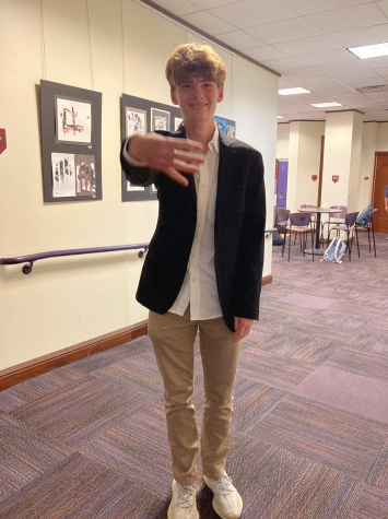
This man is moving, never stopping, and on that David Goggins grindset, trying to stack while the rest of us starve. The Yeezys are to flex through two primary methods: Stomping or your head or licking them. The shirt and khakis scream business casual while the blazer makes this statement: “I am the mob boss who makes his own hours, while you are my henchmen who must sweat in tuxedos while committing crime”. This man looks like he’s the head of a car insurance company, and you’re just his aloof salesman lacking the necessary funds to pay for their dementia medication.
Final Rating:
4/5 fingers
Austin:
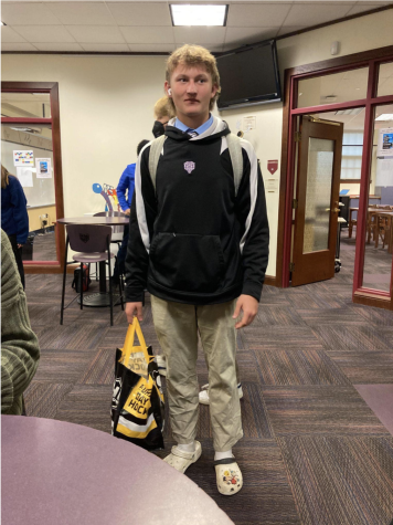
This is what Jack the Ripper looked like. Just imagine the moment before you’re quartered, and you see this dude. Thinking about this like that makes it a lot better. Brilliant use of satire.
Final Rating:
200/10
Tomer:
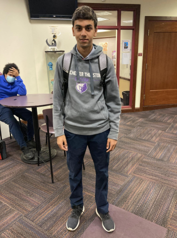
Every morning, this CMU computer-science major crawls out of his dorm room at 6:00a.m to go his 4 algorithm, engineering, physics and coding classes, somehow managing to fit a 15 minute lunch at 2pm to stuff a sandwich and water while walking to his job as a teaching-assistant, helping the kids who couldn’t get into CS and had to settle for Information Systems. At 7 pm, he returns to his dorm room to make cup ramen, and then spends 7 hours working on homework and his personal projects before falling asleep flat on his face once it’s completed and starting the whole day over again. In that process, he wears this, shielding the world from the wrinkled shirt underneath and providing enough looks to seem professional and enough comfort to use as pajamas. He fits in with the people that your parents always drive past on the way to home.
Final Rating:
4.8/5.6
Luka:
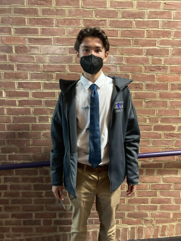
Another way to style the signature jacket is not only playing with proportions, but integrating contrasting patterns. In this case, it is the cats on the dress shirt and the khakis, which all draw your attention from the warm earth tones of cork, wood, clouds, and the ocean, to the industrial gray jacket and its font. The immediate image that came to mind was Randy Waldrum after the Pitt Women’s Soccer team after they beat Notre Dame a week ago, sitting in a foldable chair and looking like Auguste Rodin’s magnum-opus: The thinker.
Final Rating:
3/1




Brynne • Oct 3, 2022 at 11:30 pm
Total perfection, Helen.
Mrs Martin • Oct 3, 2022 at 7:01 pm
Helen should get some free WT merch for writing this stellar piece!
Margee • Oct 3, 2022 at 6:28 pm
A careful analysis as always Helen! Great work!