
Rating Soccer Boy Game Day Ties
The book Remains of the Day is a book about reflection in the midst of change. It’s also about a Butler who hides in his thoughts as one could say, from the world changing around him as what was once looked at with pride is now disgusting and vile. Maybe this is a bit of an exaggeration, but the general point still stands as a fall from grace, or rather a part of the “end of empires” as Ms. McDermott would. One of these trends/traditions that has faded from favor is the act of formal dress, seen in workplaces as businesses move towards business casual and maybe even what some would consider horrors of horrors “casual” dress. And although I don’t think like this, it’s interesting to see people embrace things considered “so last century”, and I’m not talking about socialism and fascism, but rather fashion and dress. An example of this overarching trend can be seen at WT, but not just any time of the year will suffice. It only occurs between late summer to middle autumn when the Boys Varsity Soccer Team has a game scheduled for that day. On those days, as the ocean of students shuffle around 8:15 in the morning, you can always spot a few men clothed in non-offensive colored dress shirt, khaki pants, and usually a tie to wrangle the look together; it’s like a creepy game of Where’s Waldo. But enough with this bore of an intro; The only thing you’re probably here for is the my review of their outfits, so here we go:
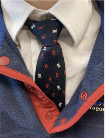
This one gets us off to a strong start. The color coordination between the tie, the Patagonia fleece, and the white dress shirt makes this outfit quite cohesive and pleasant for the eyes. And the more vibrant tones of the fleece compared combined with the Patagonia logo itself gives us some nice differentiation, but not too radical of a change.
Final Score: 8.25/10
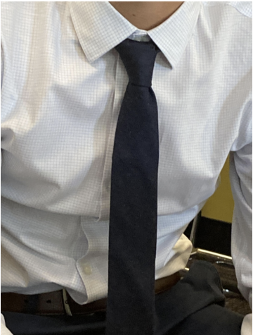
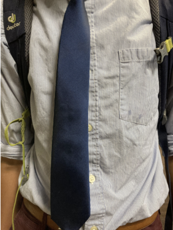
The tie is one solid shade of dark blue, but the pattern on the shirt is a nice touch and allows the tie to have a bit of pop. This intern makes the tie the vocal point of this outfit; It’s classic but effective.
Final Score: 7.952/10
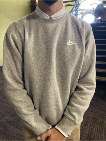
This one has no tie, and some might even consider the grey tones bland. I, however, disagree, applauding its rebellious nature, and how appreciative it is of the new and mass produced, hinted at by the Nike logo on the top right corner. Clashing is the trend.
Final Rating: 8.611/10
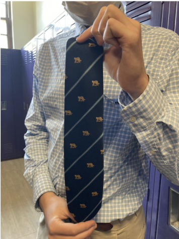
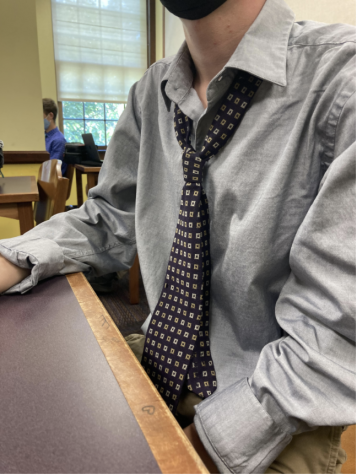
The tie reminds me of AP Euro, specifically calling back to the French revolution and the regal patterns of gold and navy associated with Louis XVI. The shirt and khakis on the other hand, call to the common French peasant, working man, and farmer who rose against him. This outfit embodies the AP European History course. Make of that what you will.
Final Rating: 1754/1793
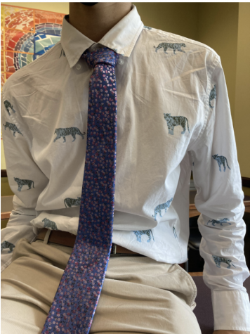
Ecstasy.
Final Rating:10/10
Tie is a nice shade of blue. The texturing to the shirt is also a nice detail, as is the folded up sleeves. It’s simple, but less is more to most.
Final Rating: 7.5/10
And rounding off the cohort of reviews we have this one. The tie’s pattern is nice, almost like lines of binary code filled with 0s. When we were analyzing paintings back when freshmen took foundations of British Literature, Ms. Mohn-Slate had us analyze romantic paintings in conjunction with the book, Pride and Prejudice. One group was talking about a painting and had used the words “muted color pallet” to describe it, and Ms. Mohn-Slate thought it was a nice word and repeated it to the class. And I think it’s a nice way to describe this pairing above.
Final Rating: 7/10


Otto Gianakas • Oct 19, 2021 at 8:08 am
Clever